
 Sign in to Mod The Sims
- Site Map >
- Community >
- Sims Discussion >
- Sims 4 >
- TS4 UI: Yay or Nay?
- Site Map >
- Community >
- Sims Discussion >
- Sims 4 >
- TS4 UI: Yay or Nay?
 25th Oct 2017 at 6:23 PM
Posts: 600
Thanks: 1768 in 10 Posts
25th Oct 2017 at 7:16 PM
Posts: 5,656
Thanks: 1035 in 5 Posts
| And the color scheme should be modified from the dated white to a more ‘Sims’ shade of blue. |
If anything, the blue is dated. White is a starker colour; stark colours are timely.
The glassy and open look of the TS4 UI is a very sensible change, but I'd have implemented it differently. The idea that a UI should be big bar at the bottom of the screen is very dated. A UI should be dynamic; full of movement. It shouldn't be there when you don't need it. You should be able to mouse over objects or Sims to reveal information about them, instead of having to rely on the UI. And the massive red outline on game pause is completely unnecessary. So is the plumbbob, by the way. The plumbbob should disappear after a few seconds, not sit there and take up space.
( Join my dumb Discord server if you're into the whole procrastination thing. But like, maybe tomorrow. )
 25th Oct 2017 at 7:48 PM
Last edited by mixa97sr : 25th Oct 2017 at 9:05 PM.
25th Oct 2017 at 7:48 PM
Last edited by mixa97sr : 25th Oct 2017 at 9:05 PM.
Posts: 1,889
Thanks: 686 in 10 Posts
Maybe it's easier to learn where things are in ts4 ui, but I don't really find it that way. I like things packed neatly in one place so I can easily switch between them and be focused on only one part of the screen while playing the game, instead of chasing different corners of the screen with my eyes, like how clock and play/pause/speed is at the bottom middle, queue is at the bottom left, needs and rest of the sim related stuff at bottom right, notifications, camera controls, mode switching and options are at the top right down to almost complete side of the screen, conversation/relationship progress is at the top middle, event timer/goals at the top right all while various popups and info bursts out in front of you taking up whole middle of the screen.
When I look at it, it's as if UI was the most irritating thing in my eye without me even noticing it. Well, same can be said about TS3, but that UI built upon previous sims games so it was way easier to get a hang of it.
So, the conclusion is, you can also see what was the main focus of each game separately.
First and second game are about simple but yet powerful tools/mechanics by which you shape your sims' worlds in which the only details are in the sims themselves, and for such a thing UI can be as simple as possible (though, I would argue that UI of the sims games is nothing near simple).
Sims 3 on the other hand focuses more on the open-ended gameplay in terms of the scale and features, and with each new feature introduced to sims 3, it had to have a technical upgrade in the UI which in return cluttered the UI.
Sims 4 already started empty in details, but full of techicalities and attributes and text, and because they could not probably fit that many stats (yes I call them stats because the new Sims craze is, I guess, all about stats and attributes) they had to cram all of the elements in category tabs (then under sub-category tabs) and then scatter all of those tabs around the screen to make it look elegant (you do this by putting small elements in corners, which is what TS4 UI is). Which means that now, besides searching under tabs for certain element you need, now you also need to search for tabs themselves across the screen.
However, and this is what i LOVE about TS4 UI is that we now don't get horrendous gigantic block of UI elements when we click on various tabs. It was solved by making buttons for each function (for example needs,career,aspiration) specially unique so that they can make them as small as possible, but more importantly, placing them horizontally and in corner, instead of vertically. This allows for more fluid selection/deselection of tabs because, how I noticed, for people it is easier to switch between horizontal buttons than verticaly placed ones (probably effect of using standard OS desktop GUI, which formed curent UI standards). It's very easy to open the menu up and then close it back down by clicking the same button.
Still, I would love to be able to revise the stats on tab hover, and if I really need to keep it open, then I need to click on the tab.
I also don't understand why haven't they gone with horizontal placement of the build/buy mode tabs in the bottom of the screen as well (If they went by the same philosophy)... would've made the whole thing 10 times better. Also, imagine ability to move the menus like windows around the screen, or the ability to even move UI elements...
Meh, it's EA we are talking about.
But still, this is my whole view on TS4 UI... Lenghty, isn't it?
Yeah, too lenghty! Damn, I went on a spree.
EDIT:
Also, Grijze, I do agree on the first thing you said. That the big white bar under the UI elements is completely unnecesarry. It could be either made way smaller or dissapear completely. And yeah the white aero look gives it that sleek, timeless feel.
But on the other hand, I don't agree of getting rid of plumbob because, first off, it's the symbol of the series, and second it really is an useful indicator when you don't know which sim you are controlling, especially now that the icon of the selected sim is not that prominent over other and that there is no more sim head in the pie menu. Maybe make the plumob smaller or less prominent but still noticeable?
I also don't agree of making game elements show UI elements on hover. It was done in TS3, and just moving your cursor across the screen over such elements made the game space look really cluttered, besides the already over-cluttered UI.
25th Oct 2017 at 7:58 PM
Posts: 5,656
Thanks: 1035 in 5 Posts
|
But still, this is my whole view on TS4 UI... Lenghty, isn't it? Yeah, too lenghty! Damn, I went on a spree. |
TL;DR kinda lengthy.
( Join my dumb Discord server if you're into the whole procrastination thing. But like, maybe tomorrow. )
25th Oct 2017 at 9:09 PM
Posts: 2,201
>inb4 8 disagrees and 1 random funny for some reason
25th Oct 2017 at 9:25 PM
Posts: 5,656
Thanks: 1035 in 5 Posts
|
I absolutely hate the white. White isn't modern, it isn't innovative. It's boring, sterile, generic, and uninteresting.The plain white is the one thing I hate about the UI more than anything else. It's the reason Windows 10 made me vomit up my sense of style. >inb4 8 disagrees and 1 random funny for some reason |
You, I imagine, would prefer something with more colour and depth?
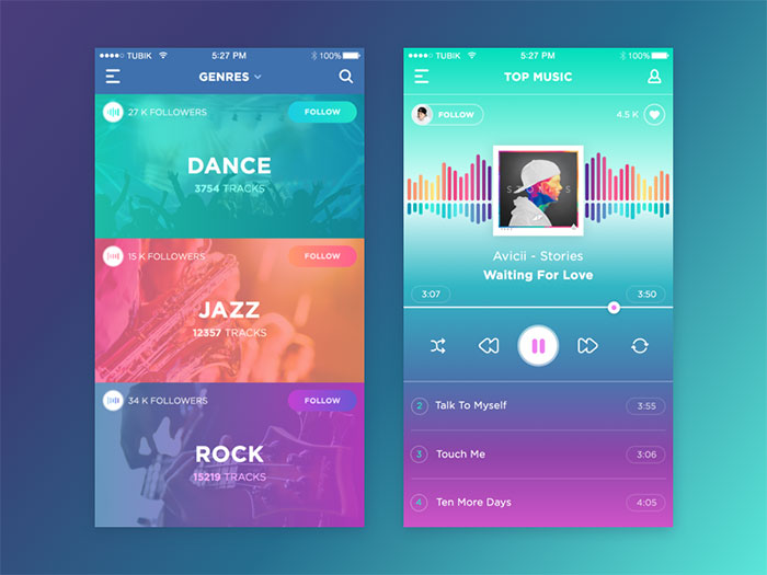
(Look at them gradients)
Or imagine TS4's UI had this kind of look to it:

( Join my dumb Discord server if you're into the whole procrastination thing. But like, maybe tomorrow. )
25th Oct 2017 at 9:38 PM
Last edited by grindingteeth : 26th Oct 2017 at 4:56 AM.
Posts: 272
Thanks: 383 in 1 Posts
It's out of the way, practically invisible at times and doesn't clutter up the viewing/playing space with a giant, blue, spacecraft looking contraption in the lower left corner. I am not really partial to things that are unnecessarily colourful, and I strongly dislike the unnecessary shapes and bubble graphics of 2 and 3. I like the clean, minimal, hideaway UI. It has just enough colour to keep it from feeling surgical. Also, I feel the design is completely intuitive without being all together in one block. It took me less than 5 minutes to be comfortable with the UI, Why? Because everything is laid out in the same locations as you would find just using Windows or browsing the internet. Toolbar at the bottom, with Start to the left, tabs and window controls in the upper right. Doesn't bother me in the least.
Not sure what makes white 'dated', when the UI was 2000's blue for over 10 years. That's dated. White, like black or grey is neutral. It cannot be dated like the early 2000's shades of blue, or 90's Window's teal. I guess someone should let apple know their entire brand is dated, time for a nice shade of blue.
They should definitely have added a UI colour option though, but we know how they feel about options.
EDIT:
| I absolutely hate the white. White isn't modern, it isn't innovative. It's boring, sterile, generic, and uninteresting.The plain white is the one thing I hate about the UI more than anything else. It's the reason Windows 10 made me vomit up my sense of style. |
I have windows 10 - everything is black. Well... black and dark, dark grey anyway.
25th Oct 2017 at 9:43 PM
Last edited by GrijzePilion : 25th Oct 2017 at 10:19 PM.
Posts: 5,656
Thanks: 1035 in 5 Posts
|
I think the most immersive thing about TS4 is the UI. It's out of the way, practically invisible at times and doesn't clutter up the viewing/playing space with a giant, blue, spacecraft looking contraption in the lower left corner. I am not really partial to things that are unnecessarily colourful and I strongly dislike the unnecessary shapes and bubble graphics of 2 and 3. I like the clean, minimal, hideaway UI. It has just enough colour to keep it from feeling surgical. Also, I feel the design is completely intuitive without being all together in one block. It took me less than 5 minutes to be comfortable with the UI, Why? Because everything is laid out in the same locations as you would find just using Windows or browsing the internet. Toolbar at the bottom, tabs and window controls in the upper right. Doesn't bother me in the least. Not sure what makes white 'dated', when the UI was 2000's blue for over 10 years. That's dated. White, like black or grey. Is neutral. It cannot be dated like the early 2000's shades of blue, or 90's, Window's teal. I guess someone should let apple know their entire brand is dated, time for a nice shade of blue. |
Could not agree more. The best UI is no UI. I like to play TS3 with the UI toggled off. I don't need most of the buttons and unnecessary thingamajigs on there. That pie menu is all I need. TS4 kind of gives that same idea by pushing everything well into the corners of the screen, and by spreading it out so that there's no large clusters of buttons or anything of the sort.
Now I personally don't mind a bit of colour - no, a fuckton of colour - but that's kind of a fad thing. We like our nauseating colours nowadays but it's not destined for a very long life. If you want to know what TS4's UI looks like with accent colours, look up Planet Coaster. It's more or less the same idea going on there, just a little more functional in terms of styling (or lack thereof).
| I have windows 10 - everything is black. Well... black and dark, dark grey anyway. |
The white-on-white Explorer windows were one of the main reasons I was all over Win10 when it came out. Don't underestimate the power of whitespace. Meaning, don't underestimate the power of using text and spacing to imply lines and borders, rather than drawing them out like a moron.
Look at this messy crap, with all its little effects and its depth and its lines and its other stupid shit everywhere:

And then look at how Windows 10 does the same thing with way less distractions:

( Join my dumb Discord server if you're into the whole procrastination thing. But like, maybe tomorrow. )
25th Oct 2017 at 10:00 PM
Posts: 1,665
Thanks: 10223 in 72 Posts
| >inb4 8 disagrees... |
Who's this now? A new designation for the legendary "Disagree Fairy" of olde? It was recently I read somewhere in the posts here that someone took offence to the notion of the term Disagree Fairy, for being offensive to gays! Well, fuck me sideways. Given enough time, it was bound to happen, I suppose. Give a person a fish and they'll eat for a day. Teach them how to troll, and fuck me sideways. So, are we now referring to the formally known Disagree Fairy, as the inb4 8, as a reference to childishness? I like it. Even if I'm prancing up the wrong path with this theory. (Not that I ever had issue with Disagree Fairy.)
Even so, for my own sins I do tend to lose the plot quite often. Always needing verification to settle the mind.

"Become a government informer. Betray your family and friends. Fabulous prizes to be won!" Red Dwarf - Back to Reality.
Find all my TS4 mods and lots here: Main Website - simsasylum.com My Section - coolspear's Mods & Lots
25th Oct 2017 at 10:05 PM
Last edited by grindingteeth : 25th Oct 2017 at 10:17 PM.
Posts: 272
Thanks: 383 in 1 Posts
|
Now I personally don't mind a bit of colour - no, a fuckton of colour - but that's kind of a fad thing. We like our nauseating colours nowadays but it's not destined for a very long life. If you want to know what TS4's UI looks like with accent colours, look up Planet Coaster. It's more or less the same idea going on there, just a little more functional in terms of styling (or lack thereof). The white-on-white Explorer windows were one of the main reasons I was all over Win10 when it came out. Don't underestimate the power of whitespace. Meaning, don't underestimate the power of using text and spacing to imply lines and borders, rather than drawing them out like a moron. |
Honestly, I quite like the white on white as well, aside from the fact I spend a lot of time staring at the screen well into the night and wee hours of the morning in a dim room. Therefore, everything I can switch to a dark palette will be switched for the sake of my eyes foremost, and my personal aesthetic second.
I agree there is so much to layout that doesn't involve actual borders, and that sort of design (spacing, layering, texture without radially shaded graphics) is the modern, minimalistic approach. Planet Coaster's UI - you're right. more colour but it maintains the clean look. That teal accent could easily be Sims blue or green without offending my eyes.
25th Oct 2017 at 10:28 PM
Posts: 5,656
Thanks: 1035 in 5 Posts
| I agree there is so much to layout that doesn't involve actual borders, and that sort of design (spacing, layering, texture without radially shaded graphics) is the modern, minimalistic approach. Planet Coaster's UI - you're right. more colour but it maintains the clean look. That teal accent could easily be Sims blue or green without offending my eyes. |
I personally don't like Planet Coaster's UI, I think it's very bland. Planet Coaster uses rounded corners, buttons with grading, and generic-looking fonts. Much like Cities: Skylines, there's a style going on where it's not detailed and skeuomorphic, but not quite flat either. The result of that is a bland, uninspiring look.
( Join my dumb Discord server if you're into the whole procrastination thing. But like, maybe tomorrow. )
25th Oct 2017 at 10:48 PM
Posts: 1,937
Thanks: 2046 in 5 Posts
~* Childish, Eco-Friendly, Snob, Couch Potato, Inappropriate *~
25th Oct 2017 at 11:08 PM
Posts: 2,201
|
You, I imagine, would prefer something with more colour and depth? (Look at them gradients) Or imagine TS4's UI had this kind of look to it: |
See now that's way too much colour. it's tacky, and overly busy. There is something in between the two...
Also I enjoyed all those little lines and separate elements on Windows 7 UI. I liked separate UI elements to look like separate elements. With 10 it's like a goddamn herd of zebras where you can't tell where one button/bar/window ends and another begins. It's blindingly white and there's nothing to fucking break up the monotony of how blindingly boring it is :\
Did I also mention how stupid the sharp corners look with absolutely no border? like, it looks like a teacher's cheap laminated shit they cut out with scissors and taped to the fucking screen. It looks so rushed, sloppy, and cheap... you know, now that I say that, it would fit TS4 perfectly...
25th Oct 2017 at 11:28 PM
Posts: 1,889
Thanks: 686 in 10 Posts
25th Oct 2017 at 11:45 PM
Posts: 2,201
| Actually, what you see on windows 10 and those minimalistically designed UIs with 'sharp corners' are actualy really subtile borders with soft border shadow that make the window or UI element still stick out while saving extreme amount of space and making that element actually look nice and not 'melt' or 'bleed' visually into other elements (thick borders overlapping tend to do that). |
I don't think a 3 pixel wide border is wasting much space... and it's a hell of a lot easier on my eyes. We have a different definition of 'nice'
Actually what would be easier on my eyes is if I could change the BG colour of the windows. The white is killing me, not to mention it's terrible for my irlen syndrome :\ it's not very accommodating for disabilities... Mind you 98 and any other that allowed you to use a '98 theme like XP (and Vista?) were the last time I saw any kind of shits being given about people with visual disabilities other than colour blindness. Their high contrast themes always looked like shit and despite applying the dark theme to my Windows 10, nothing fucking happened. Just let me fucking customise it, GDI. Why are people so against giving people choices in this fucking generation?!
25th Oct 2017 at 11:58 PM
Last edited by GrijzePilion : 26th Oct 2017 at 12:10 AM.
Posts: 5,656
Thanks: 1035 in 5 Posts
|
See now that's way too much colour. it's tacky, and overly busy. There is something in between the two... Also I enjoyed all those little lines and separate elements on Windows 7 UI. I liked separate UI elements to look like separate elements. With 10 it's like a goddamn herd of zebras where you can't tell where one button/bar/window ends and another begins. It's blindingly white and there's nothing to fucking break up the monotony of how blindingly boring it is :\ Did I also mention how stupid the sharp corners look with absolutely no border? like, it looks like a teacher's cheap laminated shit they cut out with scissors and taped to the fucking screen. It looks so rushed, sloppy, and cheap... you know, now that I say that, it would fit TS4 perfectly... |
Oh how I can tell you're not a graphic designer...
Remember, these design languages you're brushing off here are ideology. They're really quite scientific, too. They're series of rules and conventions based on things like feelings and human psychology. There's a reason we use certain shapes and colours to convey a state of mind. There's a good reason McDonald's uses red and yellow as their corporate colours. And how often have you seen a triangle and NOT thought of it as an indicator of direction? Right now, the late 90s-early 10s aesthetic of depth through shading and lifelike design elements, the one that Windows 7 was at the tail end of, is very much not done.
In fact, we're at a very interesting crossroads in graphic design right now, where BOTH the conventions of the old style and the new, the flat minimalism, have fallen out of favour. Right now, a bit of both is all the rage. Like the Fluent Design theme I mentioned before, we're starting to dabble in the unnecessary again. Depth. Motion. Shape. Material. That sort of crap. Instead of making everything square and flat, we're using shapes and patterns again. For reference, some pictures (not all of them contemporary, but all wholly relevant):

Although still flat, you can see a use of colours and shapes here that wouldn't have been acceptable - or desirable - a few years ago.

This may be a picture from 29 whole years ago, but everything I'm seeing adheres to current trends. In part, of course, because of pictures like this. It's hardly a new thing, after all.

More subtle, but still a good example. There's some throwbacks to "early" internet stuff going on; web design of the late 90s and early 00s before the whole shiny detailed fancy look took off. Everything's boxed in neatly and there's a little border around the main contents of the page. The darkness gives it a bit of edge, and the tall white lettering helps to pull you in. Like many websites today, you're supposed to look at this one in full screen.
So your argument about practicality has a lot to do with what the visual language demands. The visual language - and the designer responsible for it - has a VERY clear idea of what works, why, and isn't going to let unimportant shit like "visibility" get in the way of it, should there be an issue. Now of course, a good designer would make sure that no such problems would arise in the first place, but sometimes you just can't help it. I for one like those nauseatingly bright colours a little too much to be talked out of using them when I want to.
( Join my dumb Discord server if you're into the whole procrastination thing. But like, maybe tomorrow. )
26th Oct 2017 at 12:41 AM
Posts: 272
Thanks: 383 in 1 Posts
|
I liked separate UI elements to look like separate elements. With 10 it's like a goddamn herd of zebras where you can't tell where one button/bar/window ends and another begins. It's blindingly white and there's nothing to fucking break up the monotony of how blindingly boring it is :\ Did I also mention how stupid the sharp corners look with absolutely no border? |

If you didn't know? Here are two options that will help a) make things less terribly, horribly, blindingly white and b) add a little separation to the elements for you.
Unfortunately, File Explorer is still all white without third party content at this time.
26th Oct 2017 at 6:42 AM
Posts: 5,225
26th Oct 2017 at 7:09 AM
Posts: 2,201
|
There is a border, it's about 1.5 to 2 px in the accent colour of your choice or autopicked by the system to co-ordinate your BG. If you didn't know? Here are two options that will help a) make things less terribly, horribly, blindingly white and b) add a little separation to the elements for you. Unfortunately, File Explorer is still all white without third party content at this time. |
See, for me using dark theme did absolutely nothing. everything is still white, and I have the accent colour border, still looks like no border to me.
And none of that helps the fact that there is nothing to break up any of this garbage.

I can't see what's what and it;s incredibly irritating. there NEED to be lines to separate these elements. Nothing looks like it has a place, looks like a kid just shoved everything in a closet when they were told to clean their room.
There are probably other spots I completely missed that I can't even see to highlight...
26th Oct 2017 at 8:22 AM
Posts: 5,656
Thanks: 1035 in 5 Posts
|
I can't see what's what and it;s incredibly irritating. there NEED to be lines to separate these elements. Nothing looks like it has a place, looks like a kid just shoved everything in a closet when they were told to clean their room. |
I'd say that if you can't see what's what, that's really your problem and not the software's. Generally speaking, when things are as neatly aligned and separated as in Windows 10, a person is perfectly capable of navigating an interface like that.
( Join my dumb Discord server if you're into the whole procrastination thing. But like, maybe tomorrow. )
26th Oct 2017 at 8:33 AM
Posts: 2,201
| I'd say that if you can't see what's what, that's really your problem and not the software's. Generally speaking, when things are as neatly aligned and separated as in Windows 10, a person is perfectly capable of navigating an interface like that. |
Yes, it is my problem, I have a visual disability and they are completely unaccommodating for that fact. They don't understand that people might have specific visual needs that aren't catered to with with pure flat white or pure flat black and no customisation options.
Their dark theme isn't even a *nice* looking black. It's the worst black I've ever seen D;
26th Oct 2017 at 8:52 AM
Posts: 5,656
Thanks: 1035 in 5 Posts
| Their dark theme isn't even a *nice* looking black. It's the worst black I've ever seen D; |
That, we can agree on. Windows 10 doesn't have the best colour scheme in the world, but the dark theme really brings that out. It just inverts some colours here and there whilst doing nothing in most places. I don't think they put any thought into that.
( Join my dumb Discord server if you're into the whole procrastination thing. But like, maybe tomorrow. )
26th Oct 2017 at 8:57 AM
Posts: 2,201
| That, we can agree on. Windows 10 doesn't have the best colour scheme in the world, but the dark theme really brings that out. It just inverts some colours here and there whilst doing nothing in most places. I don't think they put any thought into that. |
I don't think they put any thought into *any* of it. it looks like it was designed in MS paint, then someone threw some drop shadow on it.
26th Oct 2017 at 9:03 AM
Posts: 5,656
Thanks: 1035 in 5 Posts
( Join my dumb Discord server if you're into the whole procrastination thing. But like, maybe tomorrow. )
26th Oct 2017 at 9:06 AM
Posts: 272
Thanks: 383 in 1 Posts
| Their dark theme isn't even a *nice* looking black. It's the worst black I've ever seen D; |
How can it be the worst black? It's solid black - it's the best black, true black #000000, not #191919 XD It makes me happy.
I am with you though, failing to have file explorer comply with the dark theme is a great fat miss on their part, and an inconsistency that irks me.
Who Posted
|
|